http://assets.sbnation.com/assets/590047/ACC_Annual_Operating_expenses_Graph_clem_v_nonclem.jpg
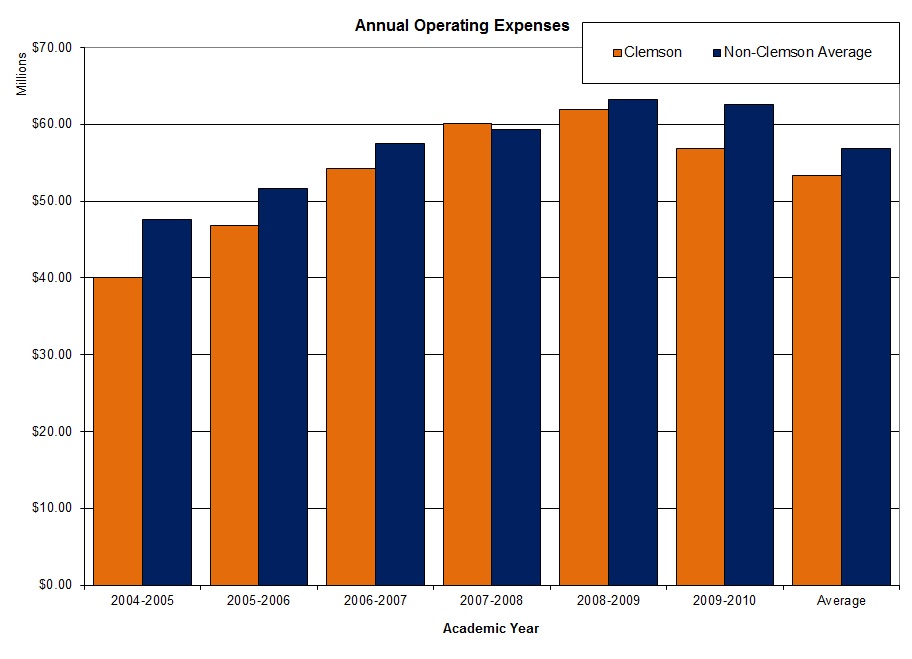
This graph shows the academic expenses starting from 2004 until now; it compares Clemson and schools that's not clemson average. It relates to my topic by talking about the academic amount and how much they spend yearly.
No comments:
Post a Comment